Jan Tschichold
Jan Tschichold
Jan Tschichold
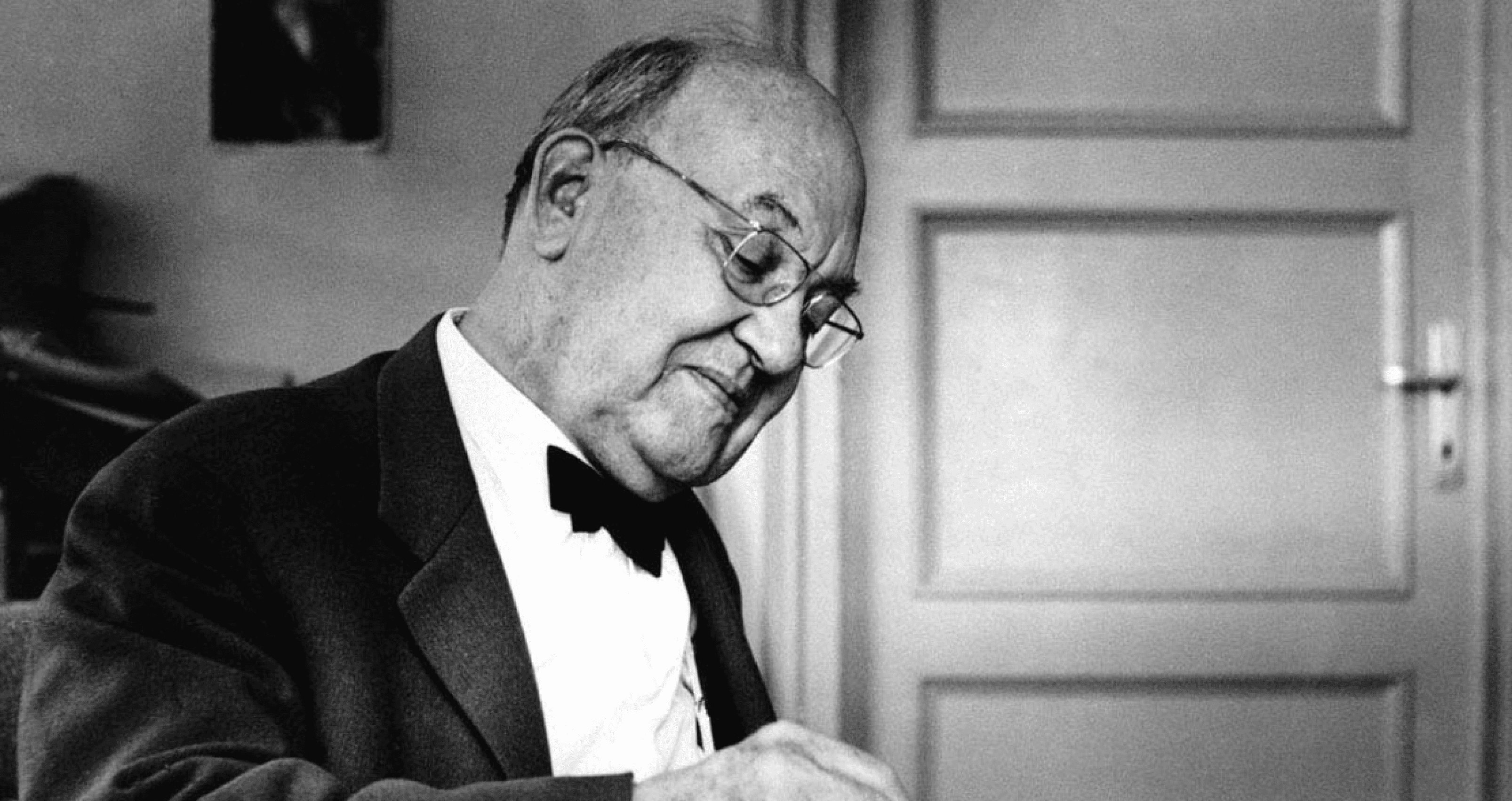


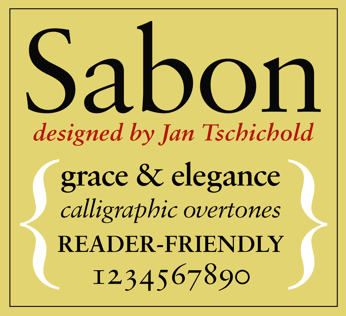
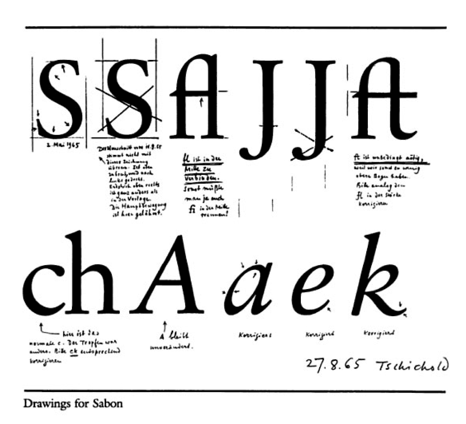
Tschichold made fonts that reflected his ideas at the time. The typefaces he created are Transit, Saskia, Zeus, Uhertype-Standard-Grotesk. His most famous font Sabon, which is still recognised today.
It was a collaborative effort involving three foundries: D. Stempel AG, Linotype and Monotype. The German Master Printers was looking for a font that would cooperate with the three different metal type technologies of that time: foundry type for manual composition, linecasting and single-type machine composition.
Initially, there were three weights: Regular, Italic and Semibold. Linotype expanded the Sabon family by introducing a joint Semibold weight. Sabon is considered a Classic, elegant, and very legible, it is known as the greatest version of Garamond. It is a good option for book design, but also works well in other contexts such as: magazine articles, advertisements, documentation, business reports, corporate design, multimedia, and letters.
Some of the characteristics of this font include generous X-height, short descenders, full counters, and bracketed Serifs. It is a moderate contrast between thin strokes.
New Typography
New Typography
Post-War Standardisation
Post-War Standardisation
Penguin Books
Penguin Books
Typeface Design
Typeface Design
Swiss Style
Swiss Style
Bibliography
Bibliography
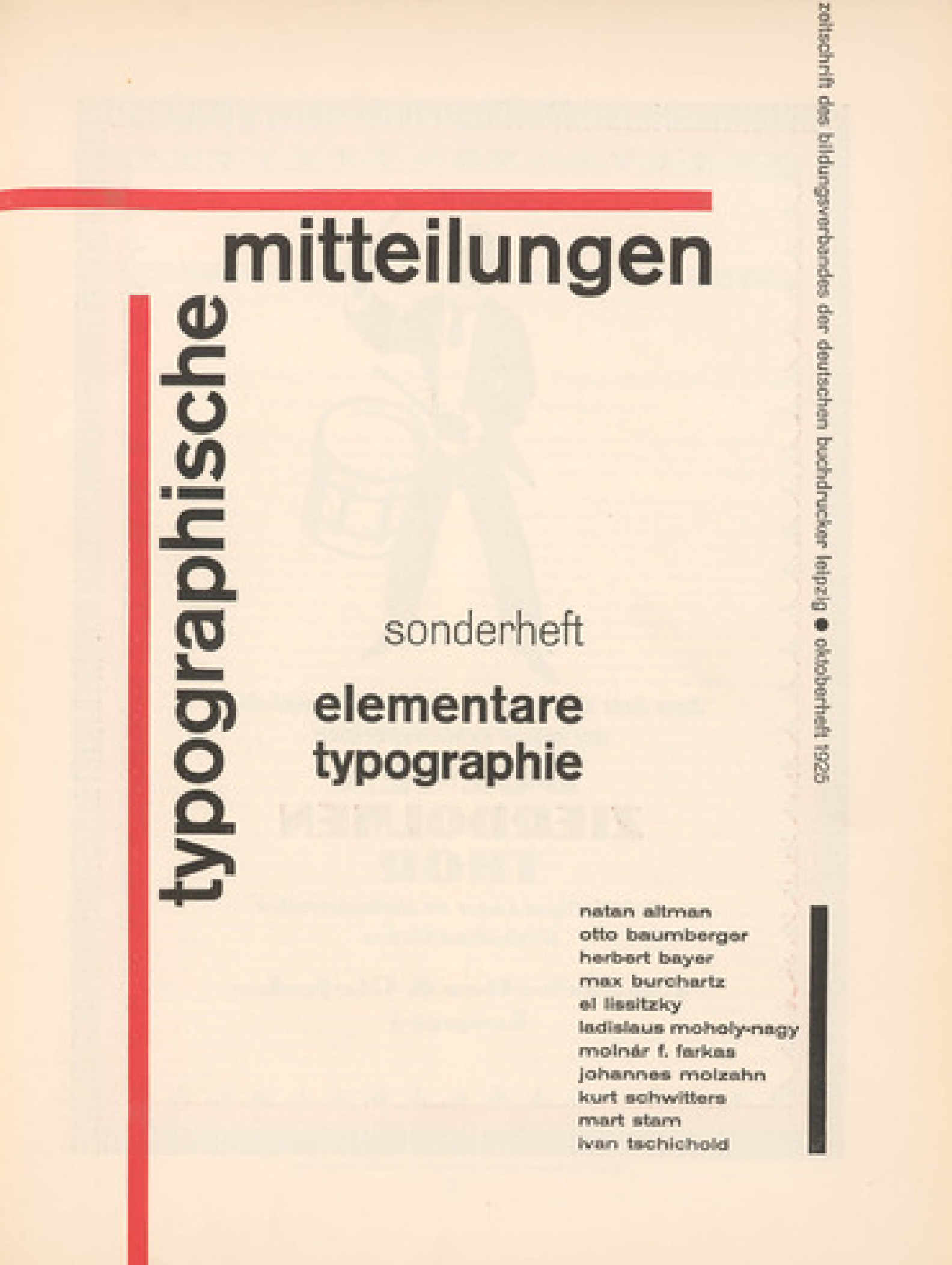
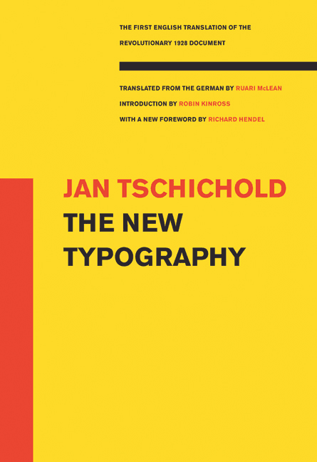
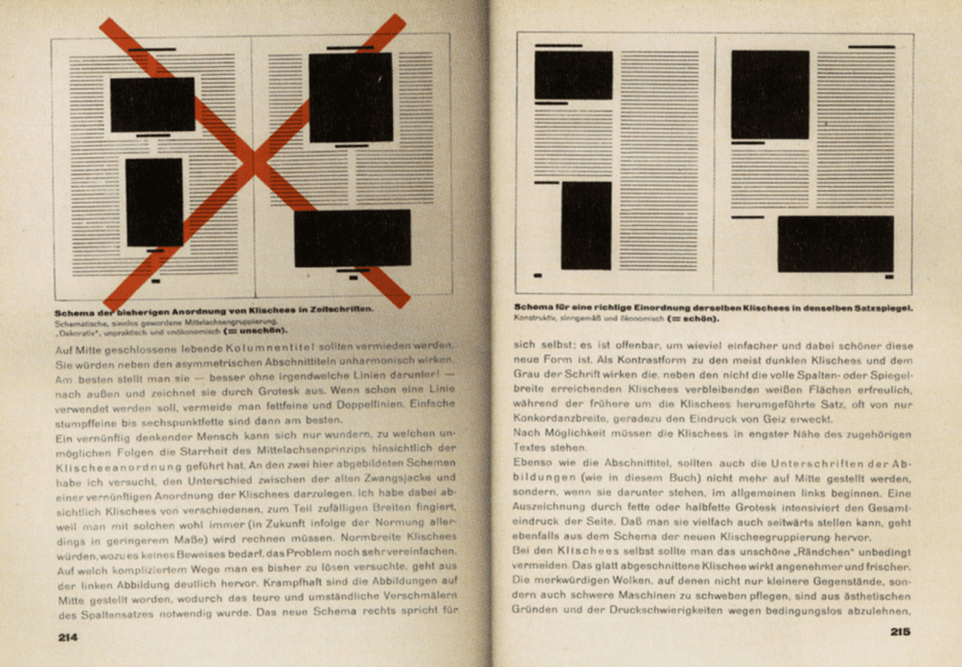
In the 1920’s, Jan Tschichold, who was a central figure in Graphic Design, helped to form the New Typography movement. In his manifesto: “Die Neue Typographie,” moved from the traditional design to introducing the principles of Asymmetry and Sans-Serif typefaces. Tschichold proposed and applied these ideas to practical projects, putting a strong importance on the clarity of his work. Regardless of moving to Switzerland, he guided to shape the contemporary designers and partaking in Post-War standardisation efforts. This essay will explore Tschichold’s early work, his influence on constructivism, development of the Penguin books, creation of typefaces, International Swiss Style, Graphic Design between the World Wars, and modern influential designer’s work. This will show an insight into Tschichold's influence on Graphic Design in the modern world.
In the 1920’s, Jan Tschichold, who was a central figure in Graphic Design, helped to form the New Typography movement. In his manifesto: “Die Neue Typographie,” moved from the traditional design to introducing the principles of Asymmetry and Sans-Serif typefaces. Tschichold proposed and applied these ideas to practical projects, putting a strong importance on the clarity of his work. Regardless of moving to Switzerland, he guided to shape the contemporary designers and partaking in Post-War standardisation efforts. This essay will explore Tschichold’s early work, his influence on constructivism, development of the Penguin books, creation of typefaces, International Swiss Style, Graphic Design between the World Wars, and modern influential designer’s work. This will show an insight into Tschichold's influence on Graphic Design in the modern world.
How did Jan Tschichold's innovative Typographic principles influence modern Graphic Design?
“The essence of the New Typography is Clarity. This puts it into deliberate opposition to the old typography whose aim was 'beauty'.”
“White space is to be regarded as an active element, not as a passive background.”
Penguin Books
Blue for Biographies
Red for Drama
Red for Drama
Pink for Travel & Adventure
Pink for Travel & Adventure
Green for Crime Fiction
Orange for General Fiction
Typeface Design
Swiss Style
Yellow for everything else


Burke, Christopher. Engaging Literature. Hyphen Press, 2007. ericcraps9262. “The 1920s: Fresh Typography.” A Chronicle of Design History, January 15, 2019, ericcraps.wordpress.com/2019/01/15/innovative-typography/
Flask, Dominic. “Jan Tschichold: Architect of Letters.” Designishistory.com, 2019, www.designishistory.com/1920/jan-tschichold/
Hollis, Richard. “Richard Hollis: The Genius of Typographer Jan Tschichold.” The Guardian, The Guardian, December 5, 2008, www.theguardian.com/artanddesign/2008/dec/05/jan-tschichold-lettering
Jan Tschichold - Renowned German Lettering Artist & Calligrapher.” Shillington Design Blog, August 11, 2016, blog.shillingtoneducation.com/jan-tschichold-tbt/.
Jan Tschichold: Master of Typography – Retinart. retinart.net/artist-profiles/jan-tschichold/.“
Jan Tschichold: Innovator, Theorist, Collector.” Merrill C. Berman Collection, mcbcollection.com/jan-tschichold-innovator-theorist-collector/. Accessed December 30, 2023. Kohlstedt, Kurt. “Iconic Penguins: How Simplistic Book Covers Attracted the Mass Readership to Paperbacks - 99% Invisible.” 99% Invisible, August 3, 2019, 99percentinvisible.org/article/iconic-penguins-how-basic-book-covers-attracted-readers-to-paperbacks/.Massimo Vignelli Discusses His Legendary 1972 New York City Subway Map | Open Culture. www.openculture.com/2014/05/designer-massimo-vignelli-explains-his-legendary-1972-new-york-city-subway-map.html.“Revolutionary Typography.” BLKBK Fonts, blkbk.ink/blogs/letters/revolutionary-typography/. Accessed December 30, 2023.Ray, Debika. “The Penguin Composition Principles.” ICON Magazine, July 29, 2015, www.iconeye.com/opinion/the-penguin-composition-principles/. Accessed December 30, 2023.“The Story of Sabon® Font Family.” Fonts.com, www.fonts.com/font/linotype/sabon/legacy/. Accessed December 30, 2023.Strizver, Ilene. “Jan Tschichold, Supreme Lettering Craftsman of the 20th Century - CreativePro.com.” CreativePro.com, October 9, 2018, creativepro.com/jan-tschichold-supreme-lettering-craftsman-of-the-20th-century/.“The Legacy of Swiss Modernism & Type Design.” Blaze Type, blazetype.eu/blog/swiss-modernism.“Wikiwand - Unveiling Sabon.” Wikiwand, www.wikiwand.com/en/Sabon. Accessed December 30, 2023.Yumpu.com. “Redefining Typography.” Yumpu.com, www.yumpu.com/en/document/read/58318595/redefining-typography/. Accessed December 30, 2023.
Bibliography
Burke, Christopher. Active Literature. Hyphen Press, 2007.
ericcraps9262. “1920s: New Typography.” A Timeline of Design History, 15 Jan. 2019, ericcraps.wordpress.com/2019/01/15/new-typography/.
Flask, Dominic. “Jan Tschichold : Design Is History.” Designishistory.com, 2019, www.designishistory.com/1920/jan-tschichold/.
Hollis, Richard. “Richard Hollis: The Brilliance of Typographer Jan Tschichold.” The Guardian, The Guardian, 5 Dec. 2008, www.theguardian.com/artanddesign/2008/dec/05/jan-tschichold-typography.
“Jan Tschichold - German Typographer & Calligrapher.” Shillington Design Blog, 11 Aug. 2016, blog.shillingtoneducation.com/jan-tschichold-tbt/.
Jan Tschichold – Typographic Genius – Retinart. retinart.net/artist-profiles/jan-tschichold/.
“Jan Tschichold: Designer, Theorist, Collector.” Merrill C. Berman Collection, mcbcollection.com/jan-tschichold-designer-theorist-collector/. Accessed 8 Dec. 2023.
Kohlstedt, Kurt. “Classic Penguins: How Minimalist Book Covers Sold the Masses on Paperbacks - 99% Invisible.” 99% Invisible, 3 Aug. 2019, 99percentinvisible.org/article/classic-penguins-how-minimalist-book-covers-sold-paperbacks-to-the-masses/.
Massimo Vignelli Explains His Iconic 1972 New York City Subway Map | Open Culture. www.openculture.com/2014/05/designer-massimo-vignelli-explains-his-iconic-1972-new-york-city-subway-map.html.
“New Typography.” BLKBK Fonts, blkbk.ink/blogs/letters/new-typography/. Accessed 8 Dec. 2023.
Ray, Debika. “The Penguin Composition Rules.” ICON Magazine, 29 July 2015, www.iconeye.com/opinion/the-penguin-composition-rules/. Accessed 8 Dec. 2023.
“Sabon® Font Family Typeface Story.” Fonts.com, www.fonts.com/font/linotype/sabon/story/. Accessed 8 Dec. 2023.
Strizver, Ilene. “Jan Tschichold, Master Typographer of the 20th Century - CreativePro.com.” CreativePro.com, 9 Oct. 2018, creativepro.com/jan-tschichold-master-typographer-of-the-20th-century/.
“Swiss Modernism & Type Design.” Blaze Type, blazetype.eu/blog/swiss-modernism.
“Wikiwand - Sabon.” Wikiwand, www.wikiwand.com/en/Sabon. Accessed 8 Dec. 2023.
Yumpu.com. “The New Typography.” Yumpu.com, www.yumpu.com/en/document/read/58318595/the-new-typography/. Accessed 8 Dec. 2023.
Burke, Christopher. Active Literature. Hyphen Press, 2007.
ericcraps9262. “1920s: New Typography.” A Timeline of Design History, 15 Jan. 2019, ericcraps.wordpress.com/2019/01/15/new-typography/.
Flask, Dominic. “Jan Tschichold : Design Is History.” Designishistory.com, 2019, www.designishistory.com/1920/jan-tschichold/.
Hollis, Richard. “Richard Hollis: The Brilliance of Typographer Jan Tschichold.” The Guardian, The Guardian, 5 Dec. 2008, www.theguardian.com/artanddesign/2008/dec/05/jan-tschichold-typography.
“Jan Tschichold - German Typographer & Calligrapher.” Shillington Design Blog, 11 Aug. 2016, blog.shillingtoneducation.com/jan-tschichold-tbt/.
Jan Tschichold – Typographic Genius – Retinart. retinart.net/artist-profiles/jan-tschichold/.
“Jan Tschichold: Designer, Theorist, Collector.” Merrill C. Berman Collection, mcbcollection.com/jan-tschichold-designer-theorist-collector/. Accessed 8 Dec. 2023.
Yumpu.com. “The New Typography.” Yumpu.com, www.yumpu.com/en/document/read/58318595/the-new-typography/. Accessed 8 Dec. 2023.
Kohlstedt, Kurt. “Classic Penguins: How Minimalist Book Covers Sold the Masses on Paperbacks - 99% Invisible.” 99% Invisible, 3 Aug. 2019, 99percentinvisible.org/article/classic-penguins-how-minimalist-book-covers-sold-paperbacks-to-the-masses/.
Massimo Vignelli Explains His Iconic 1972 New York City Subway Map | Open Culture. www.openculture.com/2014/05/designer-massimo-vignelli-explains-his-iconic-1972-new-york-city-subway-map.html.
“New Typography.” BLKBK Fonts, blkbk.ink/blogs/letters/new-typography/. Accessed 8 Dec. 2023.
Ray, Debika. “The Penguin Composition Rules.” ICON Magazine, 29 July 2015, www.iconeye.com/opinion/the-penguin-composition-rules/. Accessed 8 Dec. 2023.
“Sabon® Font Family Typeface Story.” Fonts.com, www.fonts.com/font/linotype/sabon/story/. Accessed 8 Dec. 2023.
Strizver, Ilene. “Jan Tschichold, Master Typographer of the 20th Century - CreativePro.com.” CreativePro.com, 9 Oct. 2018, creativepro.com/jan-tschichold-master-typographer-of-the-20th-century/.
“Swiss Modernism & Type Design.” Blaze Type, blazetype.eu/blog/swiss-modernism.
“Wikiwand - Sabon.” Wikiwand, www.wikiwand.com/en/Sabon. Accessed 8 Dec. 2023.
It was the chairperson of Penguin Books, Allan Lane, who approached Tschichold and asked him to work for him. He thought that a book cover should be a clear format, where the design mirrors the content. Included in his covers are geometric shapes and patterns which represent order and balance. Jan was responsible for the development of over 500 Penguin Book covers.
Since he became the Head of Typography and Production, he created the Penguin Composition Rules, which consisted of rules put in place to keep a visually appealing layout. It covered various aspects of book design, including typefaces, margins, and cover design. These rules show how important tight word-spacing, consistent spacing for all punctuation marks and to use indents appropriately in paragraphs.
The reason Penguin Books are so recognisable is because of how Tschichold introduced Grid systems, allowing the format to become standardised and the cover to become more uniform. This enables cost-effective production of the books.
Jan considered the readability of the text by choosing a Sans Serif typeface, Gills Sans, which was designed by Eric Gill. He concentrated on the tracking and kerning of the text, this added to the elegance of the overall design.
He chose eye-catching books instead of bold pictures for his colour-coded volumes. For each cover, the author and title were written in black with a white background. Jan used a horizontal grid with coloured stripes. This system was used to put different genres into categories.
Swiss Style, also known as the International Typographic Style, is a design movement that emerged in Switzerland in the 1950s. One of the key figures associated with the Swiss Style is Jan Tschichold. His influential book "Die Neue Typographie", outlined many of the principles that became foundational to the Swiss Style movement. His teachings and design philosophy have had a lasting impact on graphic design, and Swiss Style remains an important and influential design approach to this day.
Swiss Style, also known as the International Typographic Style, is a design movement that emerged in Switzerland in the 1950s. One of the key figures associated with the Swiss Style is Jan Tschichold. His influential book "Die Neue Typographie", outlined many of the principles that became foundational to the Swiss Style movement. His teachings and design philosophy have had a lasting impact on graphic design, and Swiss Style remains an important and influential design approach to this day.
Massimo Vignelli, in his creative journey, embraced Tschichold’s principles, incorporating them into his own design philosophy characterised by modernist aesthetics and functional clarity. However, Massimo was a proponent for Helvetica unlike Jan who preferred Sans Serif.
Massimo Vignelli, in his creative journey, embraced Tschichold’s principles, incorporating them into his own design philosophy characterised by modernist aesthetics and functional clarity. However, Massimo was a proponent for Helvetica unlike Jan who preferred Sans Serif.
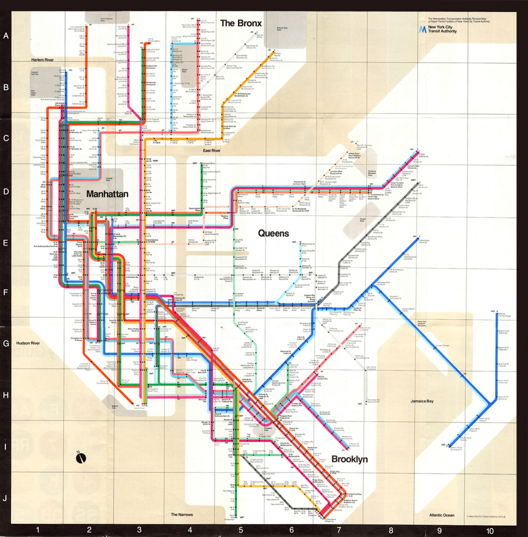
The famous New York City Subway Map, created by Massimo Vignelli in 1972, reflects his design principles rather than being a direct continuation of Tschichold's ideas. The map is known for its bold use of colour, simple and geometric lines, and clear visual hierarchy. It is not just a helpful navigation tool but also a tribute to Tschichold's enduring design legacy. The map is widely recognised and displayed, highlighting how Tschichold's principles continue to impact modern design and are still widely displayed for all to see in a matter where function is greater than form.
The famous New York City Subway Map, created by Massimo Vignelli in 1972, reflects his design principles rather than being a direct continuation of Tschichold's ideas. The map is known for its bold use of colour, simple and geometric lines, and clear visual hierarchy. It is not just a helpful navigation tool but also a tribute to Tschichold's enduring design legacy. The map is widely recognised and displayed, highlighting how Tschichold's principles continue to impact modern design and are still widely displayed for all to see in a matter where function is greater than form.
In conclusion, Jan Tschichold's profound impact on modern graphic design is evident through his pioneering contributions to the New Typography movement, his application of design principles to practical projects, and his influential role in post-war standardisation efforts. Tschichold's rejection of traditional design principles in favour of asymmetry and sans-serif typefaces marked a pivotal transition in the field, influencing not only the constructivism movement but also shaping the visual identity of Penguin Books through his composition rules and standardised covers. His emphasis on functionality over form and adherence to typography standards further extended to his typeface designs, notably the classic Sabon.
Tschichold's legacy extends beyond his own time, influencing subsequent design movements such as the Swiss Style. This impact is evident in Massimo Vignelli's work, particularly in the famous New York City Subway Map. While Vignelli's design reflects a departure from Tschichold's preference for sans-serif typefaces, it pays homage to the principles of simplicity, clarity, and functionality. The enduring recognition and display of the Subway Map underscore Tschichold's ongoing influence on modern graphic design, where his principles continue to resonate and shape the visual language of contemporary design.
Tschichold made fonts that reflected his ideas at the time. The typefaces he created are Transit, Saskia, Zeus, Uhertype-Standard-Grotesk. His most famous font Sabon, which is still recognised today.
It was a collaborative effort involving three foundries: D. Stempel AG, Linotype and Monotype. The German Master Printers was looking for a font that would cooperate with the three different metal type technologies of that time: foundry type for manual composition, linecasting and single-type machine composition.
Initially, there were three weights: Regular, Italic and Semibold. Linotype expanded the Sabon family by introducing a joint Semibold weight. Sabon is considered a Classic, elegant, and very legible, it is known as the greatest version of Garamond. It is a good option for book design, but also works well in other contexts such as: magazine articles, advertisements, documentation, business reports, corporate design, multimedia, and letters.
Some of the characteristics of this font include generous X-height, short descenders, full counters, and bracketed Serifs. It is a moderate contrast between thin strokes.
